The task was to create an application for use while at the Budapest Zoo & Botanical Garden. The primary goal is to encourage financial support for the zoo. The secondary goal is to educate and deeply engage visitors for a more enriching and memorable visit.
The Story
When I began at NNG there was a complex set of tests one had to pass in order to become a designer in the UX Division. There were actually three tests. Two design tests and one “Where’s Waldo” kind of flaw spotting test. My favorite of the three was the Budapest Zoo Phone App.
I like this test because it has some interesting parameters. For instance, one of the qualifications in the brief was that the app was for use while actually AT the zoo. Not for purchasing tickets or planning for the zoo in advance. This restriction can seem incredibly confining to many people. But it was actually liberating in that it immediately cut out the option to do the obvious and easy choices. So I researched the subject I knew very little about.
Research
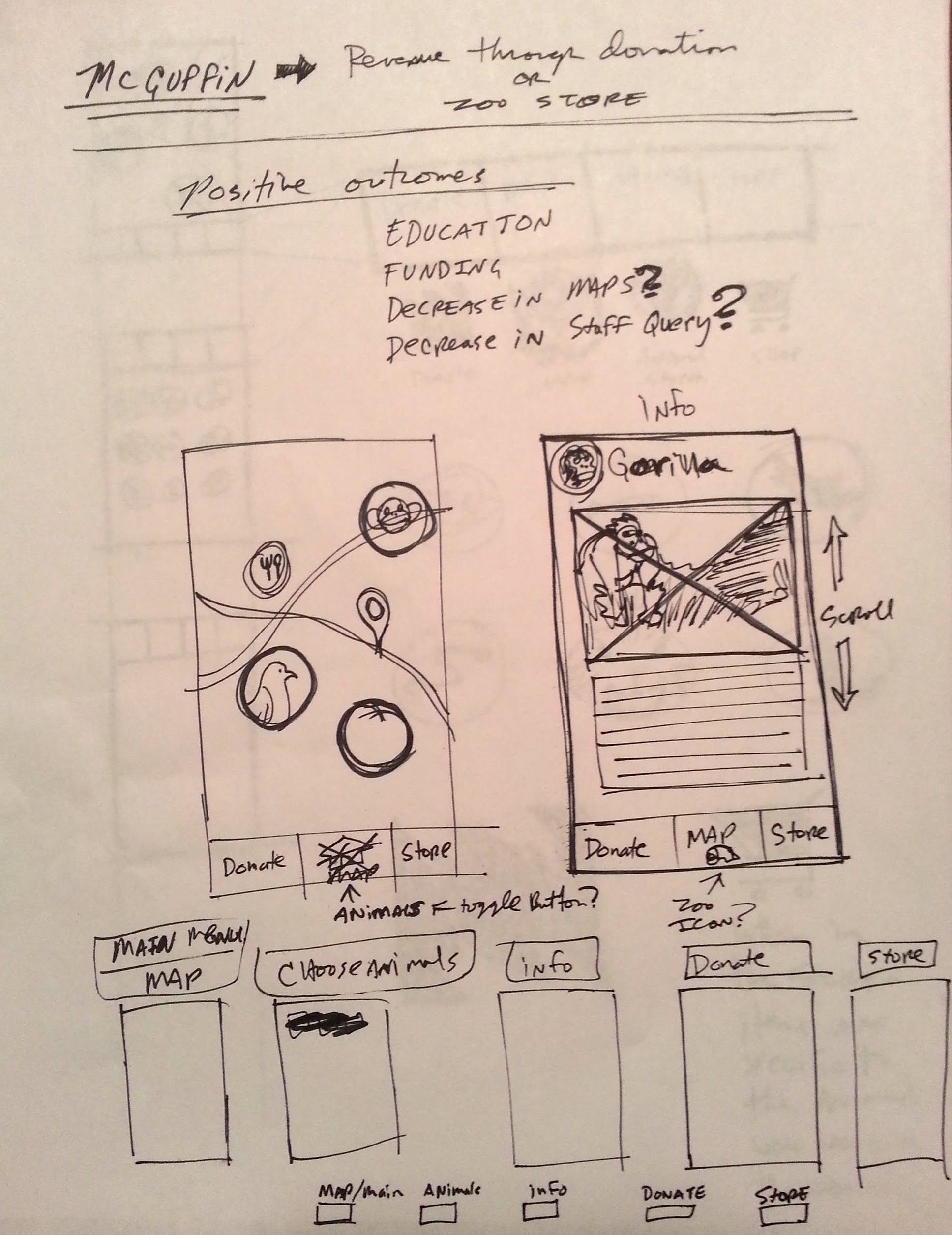
As often happens, research led to sketches. And Sketches led to more research. But above all, I had to figure out what the greatest need and goal of the zoo is.
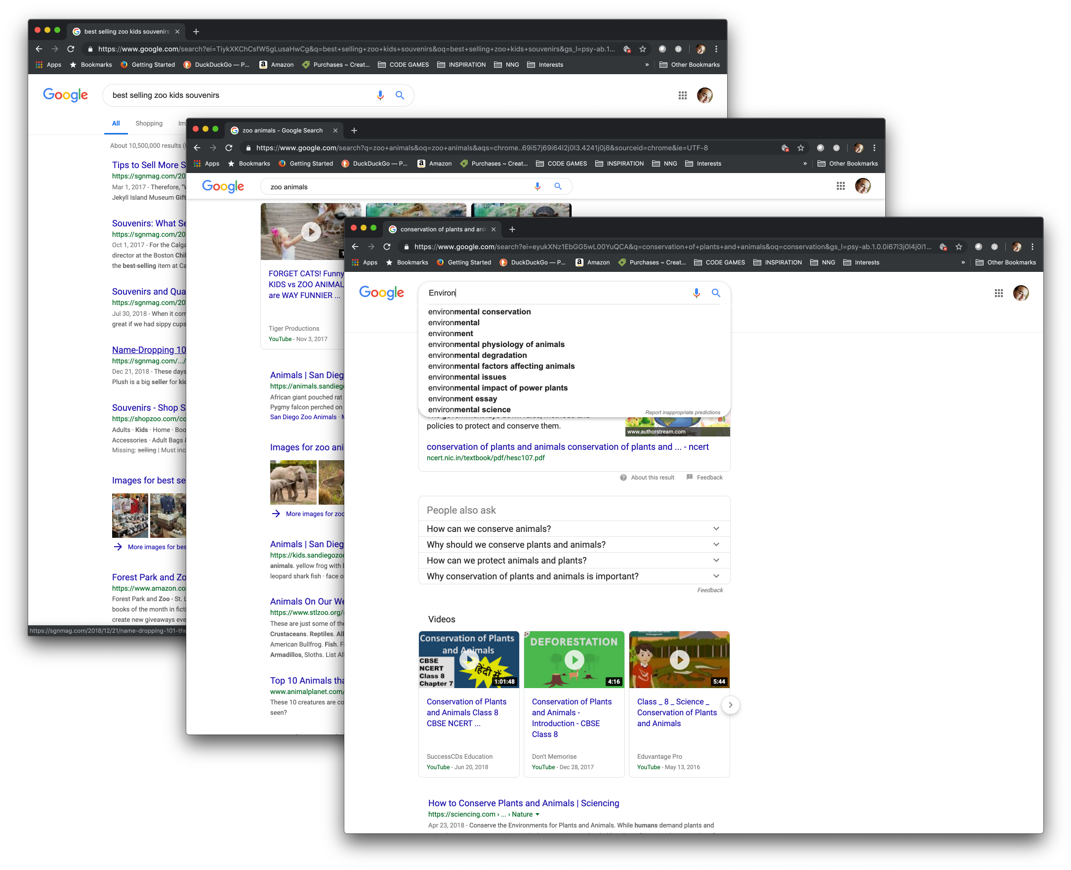
It’s no secret that zoos need a great deal of resources to function. Feeding animals, cleaning, staffing, repairs, safety, veterinarian care, all of it is amounts to a tremendous expense. So much in fact, that ticket sales alone can’t cover the costs at even the most successful organizations. In my research I discovered that people value the zoo in their cities. But if ticket prices are too high, they don’t attend. However, when donations are tied to facts about the animals and good samaritan conservations efforts, people tend to donate more than they are willing to pay for tickets.
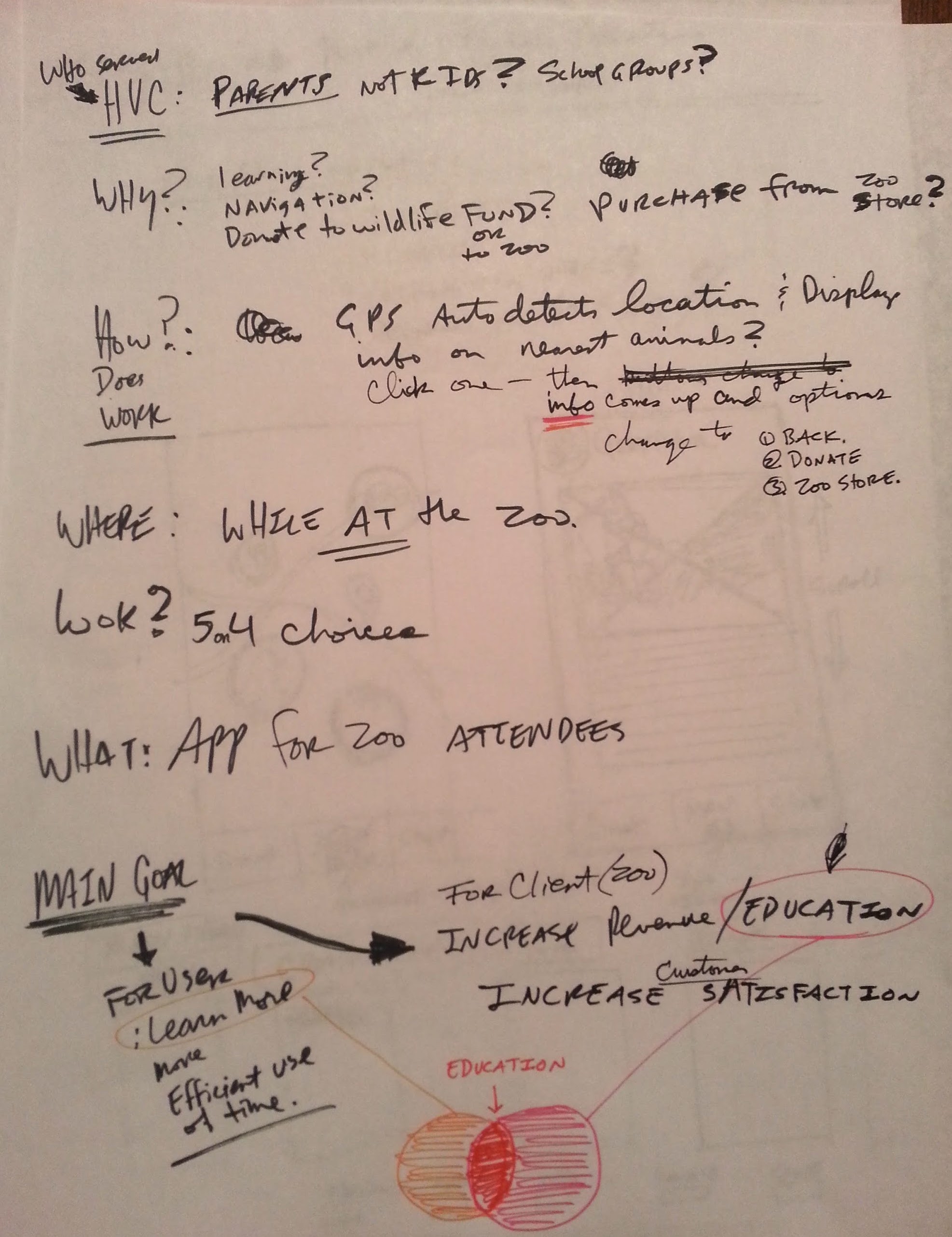
With this knowledge, I set up the goals of the application to do two things:
- Encourage donations and purchases
- Educate the public on animals, and how the zoo contributes to conservation
With these two guiding parameters, I knew that I wanted the user to ultimately encounter an opportunity to support the zoo financially. The app also needed to be relatively small so that I could complete it in a timely manner.
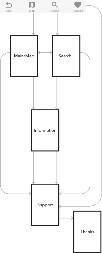
BZ Workflow
The workflow was designed early so that I could visualize the primary goal. (Encouraging financial support for the zoo.) The secondary goal of educating the user was the next item of import. I also knew that I wanted the user to be able to access those two goal pages from anywhere in the app quickly.
The Main map page is the entry point and the primary “why” for the user to want the app.
The Big Idea
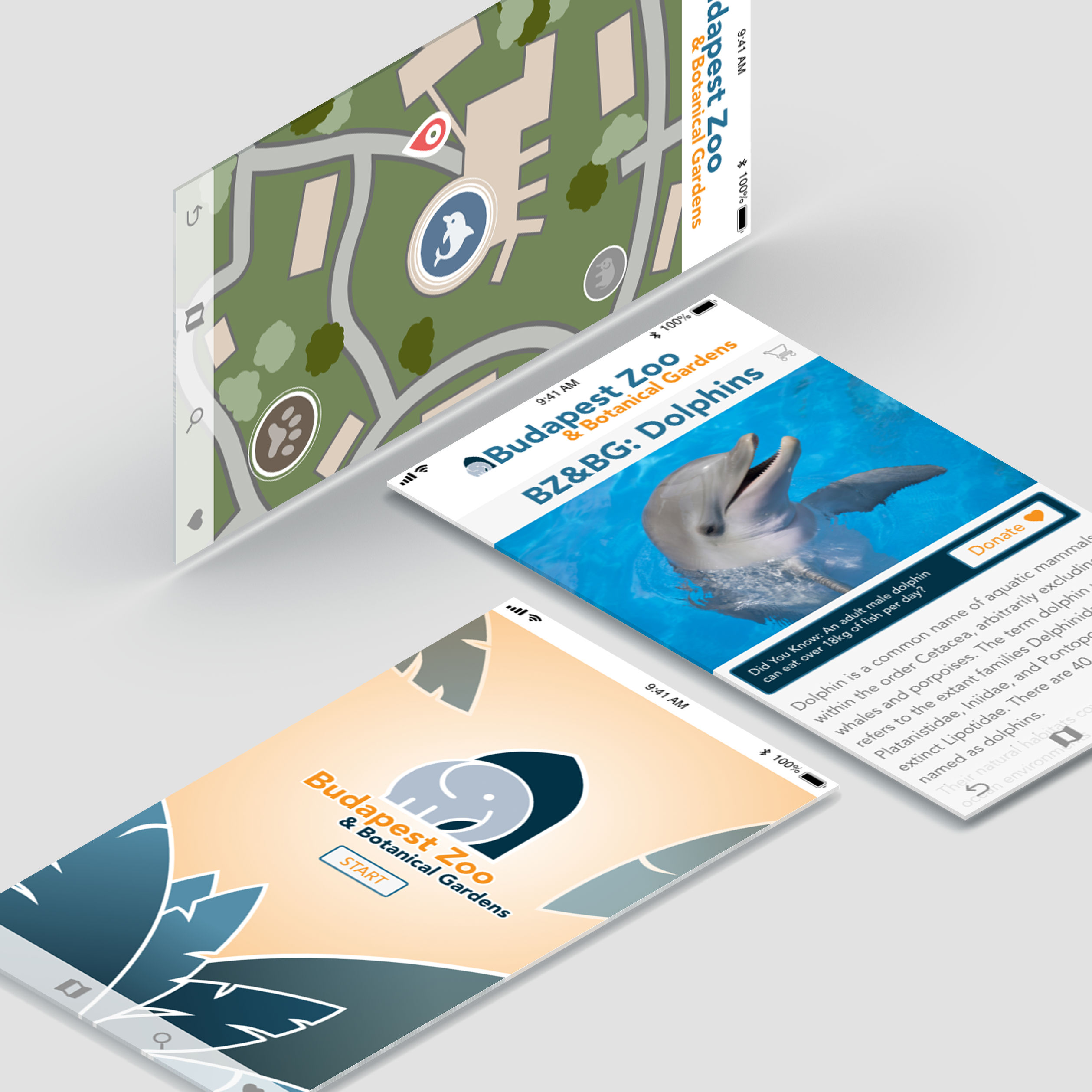
I decided to focus on a useful zoo map application. In the app, animal icons display over locations of the animals. And those icons get bigger as the user gets closer to that area. The result is heightened anticipation for the user. But additionally, the user could tap the icon to view an educational page about the kind of animal they were viewing.
Prominently displayed along with that information is a fact about the expense of caring for the animal and a convenient donation button as well as a shopping cart by the name of the element. Both the shopping cart and the donation button take the user to the Donation / Shopping page. The user could easily navigate any of these pages by swiping up to get the icons on the bottom overlay.

Prototoype
Budapest Zoo Prototype
The prototype is an example of the RAPID in rapid prototyping practices. but it demonstrates the fundamental effectiveness of the design solution. Although very challenging, it was a interesting and creative way to start my tenure at NNG.
Click the image below to interact with the prototype
