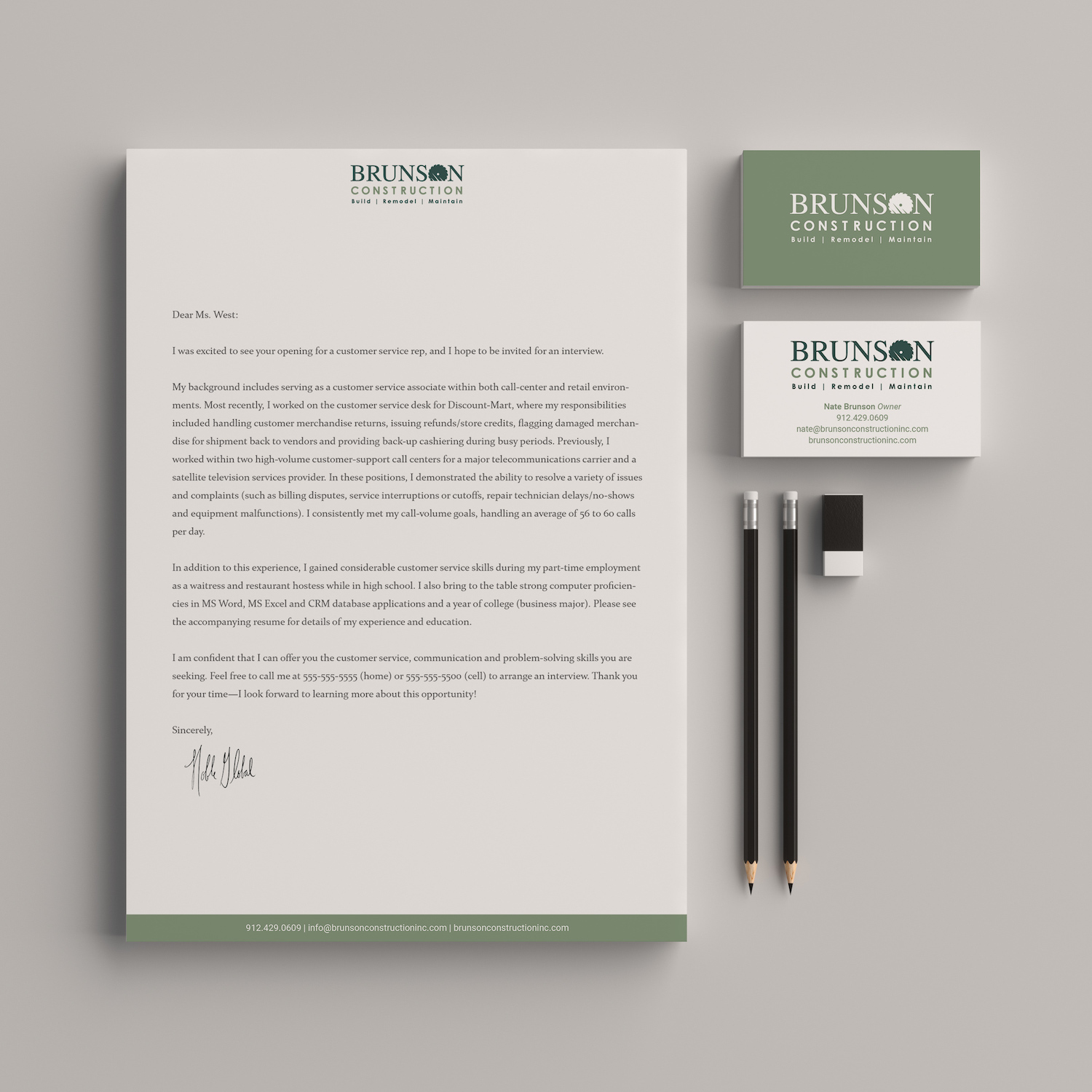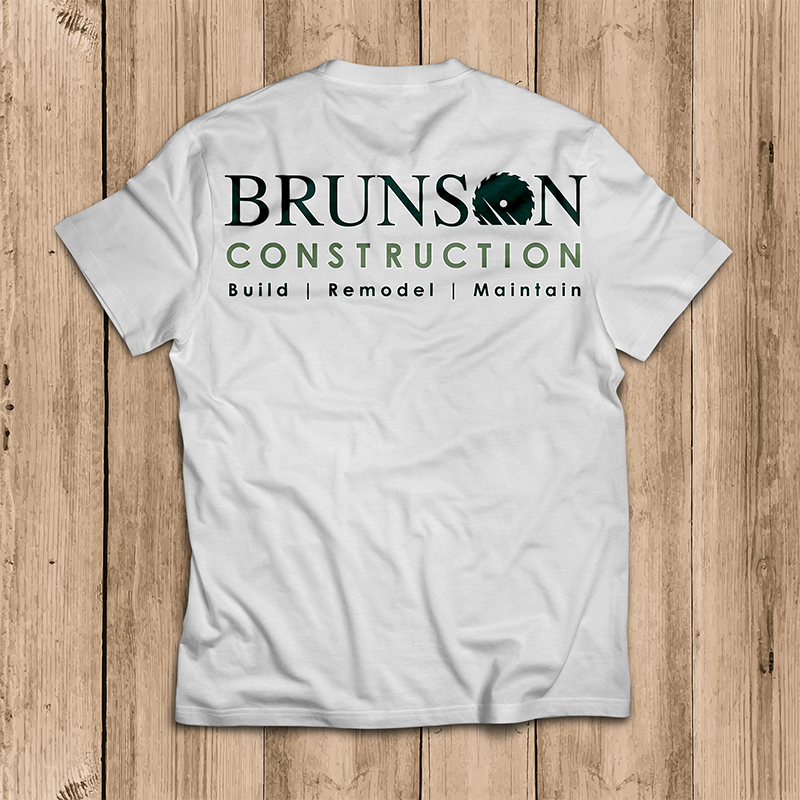
Brunson Construction is a company that puts out superior quality with dramatic speed. Nate Brunson’s company needed a design that matched that intensity.
Nate started his business alone and grew it to multiple employees within just a couple of months. The need in the market for fast, high quality craftsmanship was greater than even he had anticipated. A few months in, he had no logotype, no website and some very generic business cards.
Realizing his rate of growth and income potential may be restricted by insufficient design, he contacted me for a meeting. I sent Nate a questionnaire to help him focus his thoughts about the identity design.
At our first meeting we clarified the budget, the intended audience, and the key concepts about the service that are important for his audience to know.
- Name Recognition
- Construction
- Contemporary
- Efficiency
- Excellence
- Geography
With those items identified, I had my design brief from which I could begin research. Upon review of the competition, we decided that a clear icon that could be applied to a multitude of collateral materials with or without the text would be the best approach.
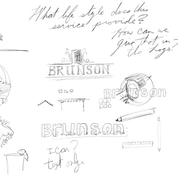
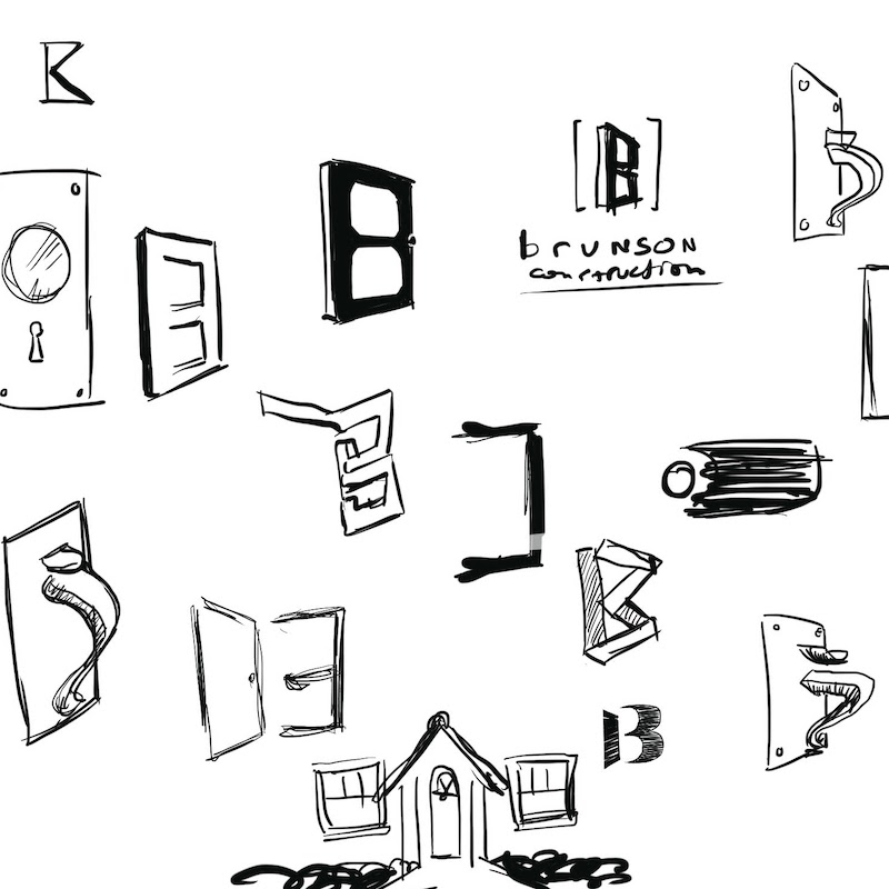
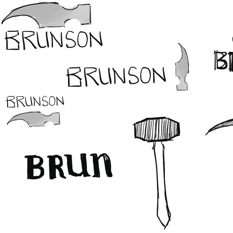
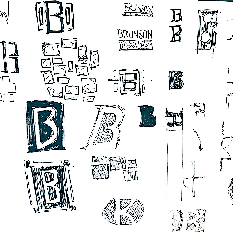
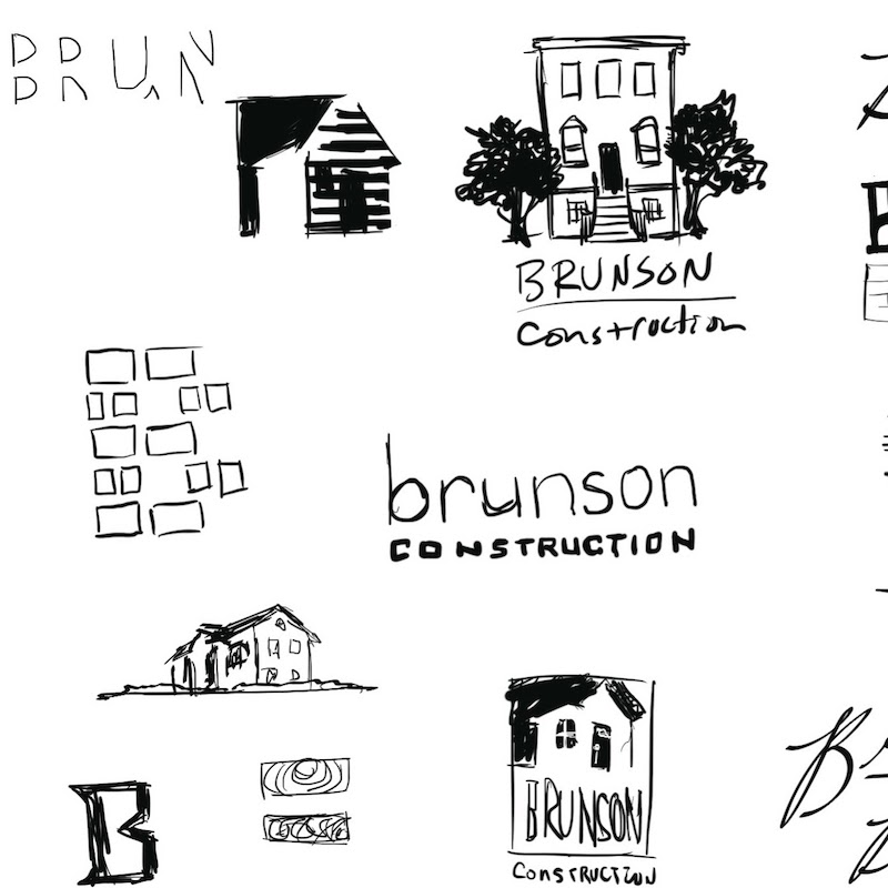
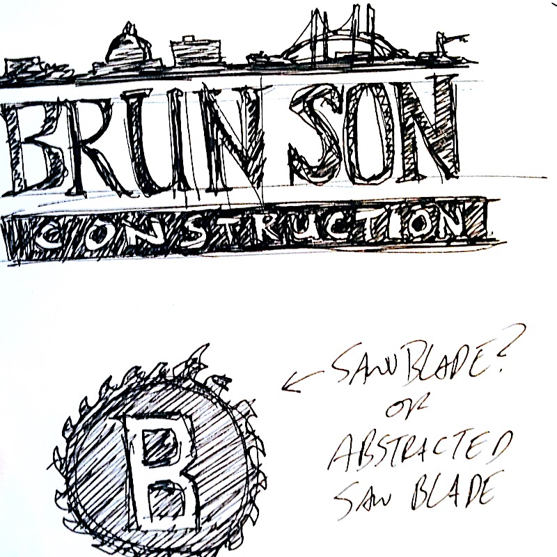
Sketches went in a broad variety of directions for this project. I typically hand sketch between 80 and 150 sketches before presenting a few to the client. Displayed here is a subset of the thumbnails for this project.
Once there were a few kernels of possibility, I brought some of the thumbnails to Brunson for review and discussion. After this meeting, I produced several digital comps.
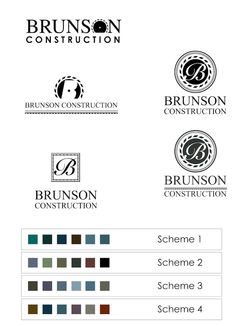
I completed the comps for the deadline. However, once we began the discussion of them, we were all left feeling like the design should be stronger and more distinct from the competition. It was at this point that I went back to the research phase of development.
It often happens in a project that even when we think we’ve passed a step in the process, that we have to return there with the new knowledge that we’ve gained from going into later steps. This is what it means to refer to an “organic process” of design. Sometimes we think of this as being counterproductive or as time wasting. But that’s untrue. A great design process makes room for this kind of iterative looping procedure in order to make the best possible final deliverables.
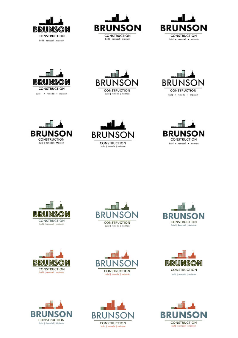
With the new research in mind and revisiting some of my earlier sketches, I set about making another digital comp. That comp became the final design which all stakeholders were excited to buy into.
